IE CLass
IE Class was a project where we used coding to develop a plethora of web pages. There were a lot of different skills learned with this project and it was very interesting. We used HTML and CSS to create and transform the webpages to make them how we needed to make them. We had to create multiple web pages wit ha lot of different properties and designs, with tables and images, and a whole lot of things. A lot of things were learned and a lot of things could have been done a little bit differently, but it was a good experience.
Ultimate Fitness Website
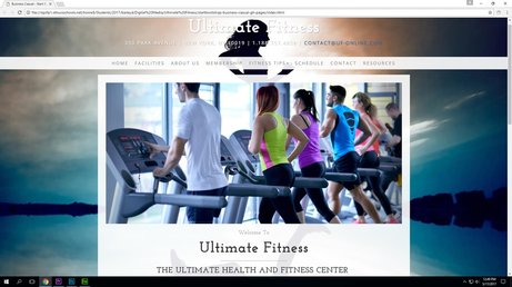
In this project we developed a website for a fictional business, Ultimate Fitness, using Adobe Dreamweaver. It was a fun project that took a lot of work. There was a lot coding involved and work with the styling of the pages and different elements. I had to create different web pages for the different parts of the business and also use Photoshop for the logos and things like that. I learned a lot throughout this project. If there was something I would change it would be that I would find a different background picture for the web page.
FACE Quote
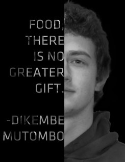
In this project we found a quote and used Photoshop to put it on our face. We separated it so it only covers half. It was a cool project. We took our pictures and found a quote we liked to put over it. We masked our heads and put a black background in and then put a black thing over our faces. We put the quote over our faces and masked out that part of the black and removed the text so that where the text was is now transparent. After that I put shapes behind the black where the letters could not be seen so that they would show. The project was fun and really cool.
Premiere
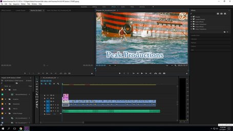
The Adobe Premiere projects were really fun and cool. The program is confusing and a little difficult to work with because of all the tool and different things that it has. Editing and cutting the videos was simple and it was cool to be able to put your own touch on the video. It was a great experience and there were some things in the videos that I would have changed and done differently when looking back on it.
Motivational Poster
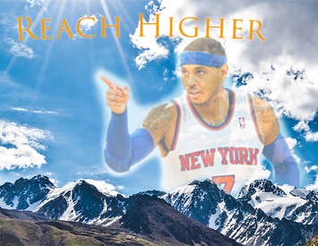
In this project, I created a motivational poster with the quote "Reach higher." This means to reach higher in everything you do, to try to be better than what you first thought was best. When designing this, I started with the image of the mountains and the sky, then I added the picture of Carmelo Anthony and turned down the opacity. Then I added the quotes and edited the text. I like how it looks but if I changed it, I would have found a picture with better quality so that when it printed the image was clearer.
Online Advertisment
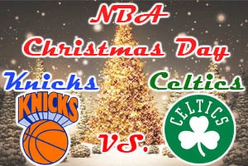
For this project, we had to create an online advertisement. I chose to make an advertisement for the NBA's Christmas day game between the New York Knicks and the Boston Celtics. First, I created the background and added the image of the Christmas trees. Next, I added the logos of each of the teams and added an outer glow effect to make it pop. I then added the text and added an outer glow effect to each piece of text, just like the logos. If I had to change something, I would change the position of some of the text to make it easier to rad and make it look better.
Flag
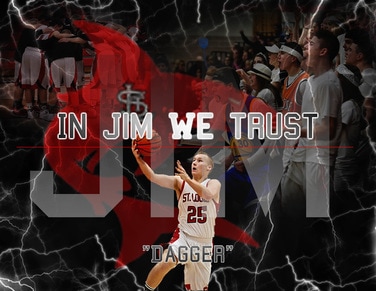
In this project I made a flag representing my friend Jim. I started with a black background and then added the text. I then added the pictures and adjusted the opacity until I liked how it looked. I used a the brush tool for the lightning, which I downloaded. I'm not sure that there is anything I would change about this project besides add two more pictures in the bottom corners.
Magazine Cover
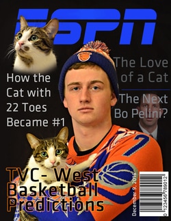
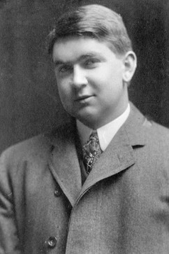
- For this project, we had to make a magazine cover. I used a picture of myself and my cat as the background image. I attempted to model the design or style of it after ESPN the magazine. I downloaded fonts for the different texts, one for the title and one for the titles of the articles. I changed the colors of the articles just to make it look better. I added a picture of Bo Pelini under the article title with his name. I added a barcode to make it look more like a magazine cover. I also made changed the color of the cat's eyes from a dull green to a more vibrant green. Since the downloaded font for the title is not perfectly similar to how the title looks in real life I added a rectangle object and matched the color with the text and used it to connect the S and the P. If I had to change something on this I would try to come up with better fake article titles and figured out how to make the text effect to work over all the letters one the "TVC" title.
MASKING
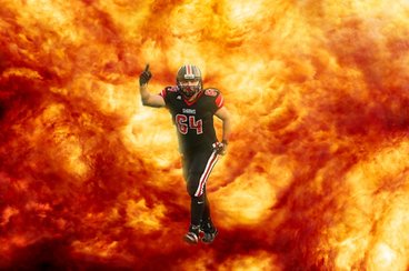
This project was pretty easy. All i did was add the image of the football player then the flames and masked out the background of the football player to replace it with the flames/explosion. If i redid this project I would reposition the player and be more precise when masking the image.
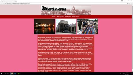
html/css
#1 Photoshop project
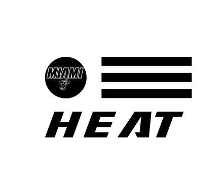
For this project I needed to download a font. I chose to download the font used by the Miami Heat. I saved one of their logos and made it circular. Then added the three black bars. Next, using the downloaded font I simply put the word Heat across the bottom. If I redid this I might add more color or add another in the bottom left and put more bars on the bottom right with Heat in the middle.
#2 photoshop project
For this project we had to take an old image and retouch it. This image had a ton of marks on it that were basically just a ton of white spots. They were all over the picture and kind of ruined it. By using the spot healing tool I got rid of all of the spots to make the image look cleaner and better. There is not much that I would change if I redid this project.
#3 photoshop project
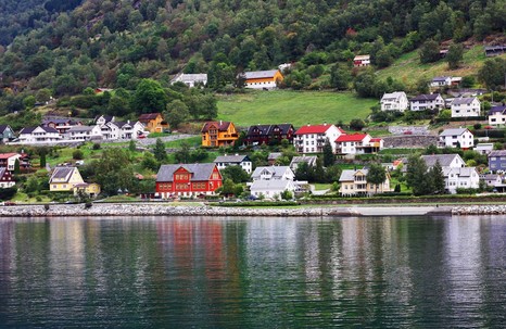
In this project, there was a lot of things done. The colors were changed to make it look better. Light posts and other various things were removed from the picture. The shore was made so that it went in a straight line across the image so that it was not at an angle. If i were to redo this I would
#4 photoshop project
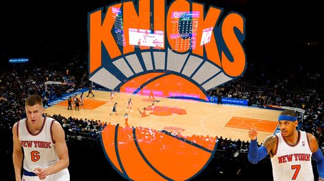
In this piece, I cropped an image of Madison Square Garden so that it showed mostly just the court. Then I used the selection tool on each of the three other images and deleted the background so that the only thing shown was the player or logo. I placed the two players in the bottom corners and then the logo in the center. I changed the opacity on the logo so that the background is still visible. If there was something about this project I would change, I would maybe find more pictures of players to add to the image.
#1 Illustrator project
This project was quite simple. I started with two rectangles, then added 3 circles and placed them accordingly. Next, I selected every shape and combined them to make one and filled it. I removed the black outlines of all the individual shapes. Then I selected it and made the edges rounded. If I redid this project I would change the sizes of some of the individual shapes to make it look better.
#2 illustrator project
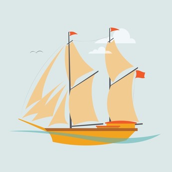
In this project, we used lines and shapes to produce the image. Using different tools to create smooth, curved lines for the sails and the body of the boat. Then filled each new shape made of the different lines with color. If I redid this project I don't think there is anything I would or could change because this was made based off of directions from a tutorial.
